Color Scanning App
New Feature Design & Product UI/UX
Product design for a color recognition app. I worked on expanding an existing mobile product with new color selection flows, calibration screens, saved scans and palettes, while also creating App Store advertising concepts for a new feature
Product design for a color recognition app. I worked on expanding an existing mobile product with new color selection flows, calibration screens, saved scans and palettes, while also creating App Store advertising concepts for a new feature
Industry
Product / Utility App
Scope
Feature Design within an Existing Product
Role
UI/UX Design · App Store Creative
Year
2026
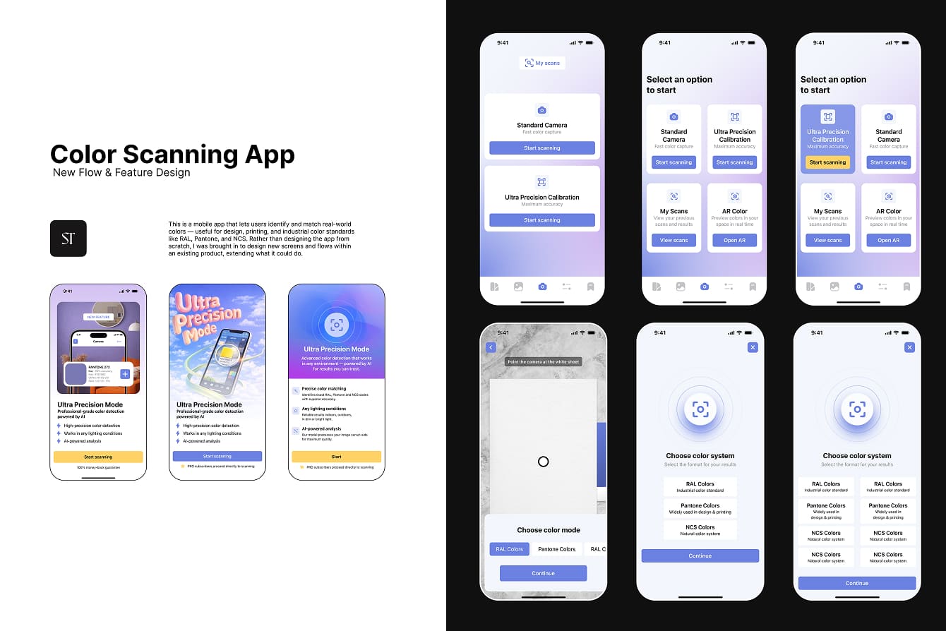
This is a mobile app that lets users identify and match real-world colors — useful for design, printing, and industrial color standards like RAL, Pantone, and NCS. Rather than designing the app from scratch, I was brought in to design new screens and flows within an existing product, extending what it could do.
Designing a New Color-Scanning Flow
I designed a new path for scanning and identifying color, starting with a choice between two capture modes — a fast Standard Camera and a more thorough Ultra Precision Calibration for higher accuracy. The calibration path walks the user through a short onboarding (using a white sheet, keeping the phone close to the surface, avoiding shadows) before letting them choose which color system to match against — RAL, Pantone, or NCS — and view their results with hex, RGB, and CMYK values alongside the closest matches.
I designed a new path for scanning and identifying color, starting with a choice between two capture modes — a fast Standard Camera and a more thorough Ultra Precision Calibration for higher accuracy. The calibration path walks the user through a short onboarding (using a white sheet, keeping the phone close to the surface, avoiding shadows) before letting them choose which color system to match against — RAL, Pantone, or NCS — and view their results with hex, RGB, and CMYK values alongside the closest matches.

Filters & Saved Palettes
Alongside the scanning flow, I designed the surrounding features that make scanned colors useful afterward: a saved scans list and filtering, so users can build and revisit their own color palettes over time rather than losing a result after a single session.
Alongside the scanning flow, I designed the surrounding features that make scanned colors useful afterward: a saved scans list and filtering, so users can build and revisit their own color palettes over time rather than losing a result after a single session.
Result
A new, higher-precision path through an existing app's core feature, plus the palette-saving tools that give scanned results lasting value, and three distinct paywall design directions built to test which angle would convert best for the feature's launch. The client responded positively to the work throughout development.
A new, higher-precision path through an existing app's core feature, plus the palette-saving tools that give scanned results lasting value, and three distinct paywall design directions built to test which angle would convert best for the feature's launch. The client responded positively to the work throughout development.
Paywall Design Variants
Alongside the scanning flow, I designed three variants of the in-app paywall/upsell screen promoting Ultra Precision Mode, each built from a different visual angle for A/B testing: a product-driven version leading with the in-app color-match interface itself, a marketing-driven version built around a bold typographic hero visual, and a generic UI version leading with an icon and a clear feature list. Same feature, same goal — three different ways of making the case for it.
Alongside the scanning flow, I designed three variants of the in-app paywall/upsell screen promoting Ultra Precision Mode, each built from a different visual angle for A/B testing: a product-driven version leading with the in-app color-match interface itself, a marketing-driven version built around a bold typographic hero visual, and a generic UI version leading with an icon and a clear feature list. Same feature, same goal — three different ways of making the case for it.
One flow decision came out of a discussion with the client: after a scan, should the user land straight on the results page, or see a visible "Processing" status first? I proposed keeping processing visible — it's reassuring for the user to see that something is actively happening rather than being dropped straight onto a results screen with no context for the wait. We also discussed whether palette selection should be a separate step in the flow or built directly into the results screen itself, weighing a more guided path against a faster, more integrated one.


About me and Services

I’m Tamara, a web designer and developer creating thoughtful digital experiences for businesses and brands.
My work combines visual design, UX and development to create websites that are not only distinctive, but clear, functional and built to support business goals.
From the first structure to the final responsive layout, I stay involved throughout the process — turning ideas into websites that are ready to grow.
My work combines visual design, UX and development to create websites that are not only distinctive, but clear, functional and built to support business goals.
From the first structure to the final responsive layout, I stay involved throughout the process — turning ideas into websites that are ready to grow.
Web Design
I design websites that balance visual impact with clear structure and intuitive user experience. Each project starts with understanding your goals, audience, content and brand — then turning them into a distinctive visual language and a clear user journey.
From information architecture and wireframes to visual design and responsive layouts, I focus on creating websites that are easy to navigate, communicate value clearly and support your business goals.
From information architecture and wireframes to visual design and responsive layouts, I focus on creating websites that are easy to navigate, communicate value clearly and support your business goals.
Tilda / Webflow / Wix / Flexbe
I design and develop modern, responsive websites — from compact landing pages to complex multi-page platforms. My approach combines strategic structure, clean layouts, and smooth interactions, ensuring that your website is both functional and visually compelling. Every detail — from typography to mobile optimization — is carefully considered, so your site looks professional and works seamlessly on any device.
Brand Identity
I create visual identities that give brands a clear and consistent visual language across digital and print. Starting from the core idea, I develop logos, typography, color palettes, graphic elements and supporting visuals that work together as a cohesive system.
The goal is not simply to make a brand look distinctive, but to create a visual identity that communicates its character, builds recognition and works consistently across websites, social media, advertising and printed materials.
The goal is not simply to make a brand look distinctive, but to create a visual identity that communicates its character, builds recognition and works consistently across websites, social media, advertising and printed materials.
